前言
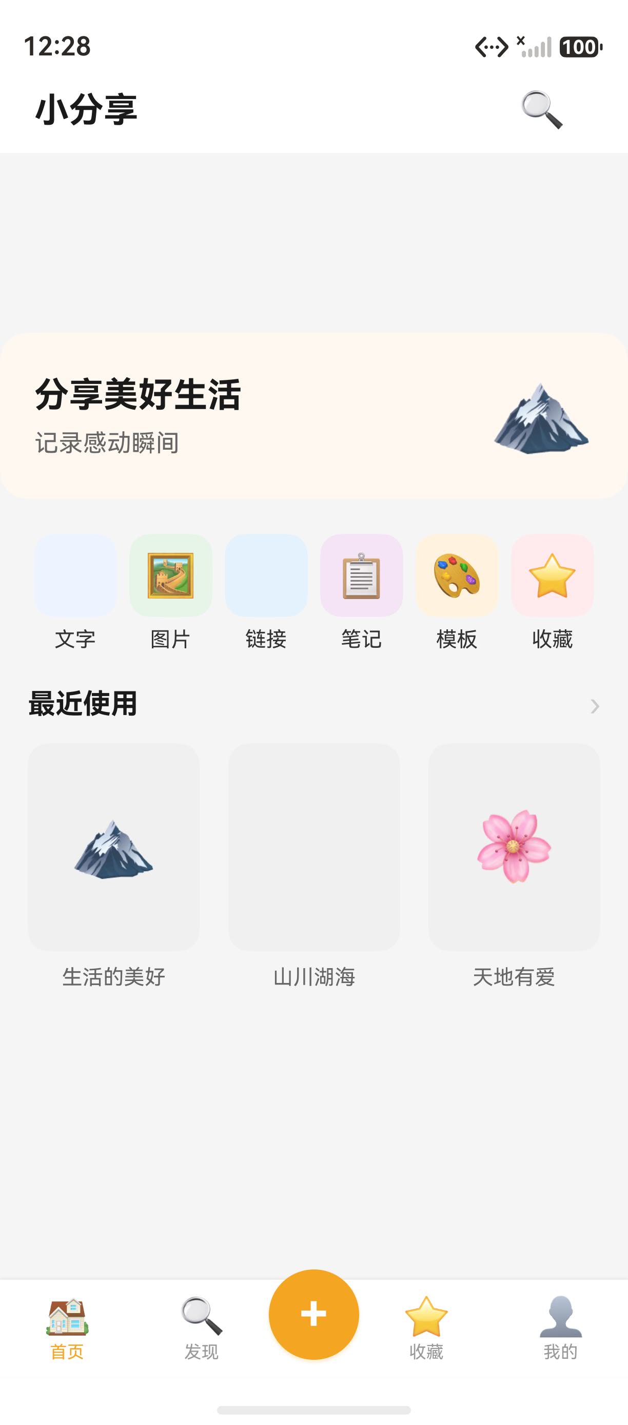
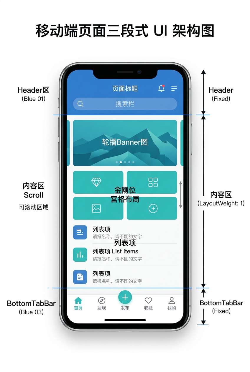
三段式架构(Header + 内容 + BottomTab)是移动应用最经典的页面骨架。本篇以小分享 App 的 HomePage 为例,讲解 Header + Scroll + BottomTabBar 三段式架构的实现,涵盖布局容器、对齐方式、layoutWeight 权重等核心概念。详细 API 可参考 HarmonyOS ArkUI 布局官方文档。
一、HomePage 完整代码
1.1 HomePage.ets 全文
小分享 App 的 pages/HomePage.ets 如下:
import router from '@ohos.router';
import { BottomTabBar } from '../components/BottomTabBar';
import { CategoryItem, RecentItem } from '../common/interfaces';

@Entry
@Component
struct HomePage {
  @State currentTab: number = 0;

  private categories: Array<CategoryItem> = [
    { icon: '', label: '文字', color: '#5B8DEF', bg: '#EEF4FF', page: 'pages/TextEditPage' },
    { icon: '🖼️', label: '图片', color: '#4CAF50', bg: '#E8F5E9', page: 'pages/ImageEditPage' },
    { icon: '', label: '链接', color: '#2196F3', bg: '#E3F2FD', page: 'pages/LinkEditPage' },
    { icon: '📋', label: '笔记', color: '#9C27B0', bg: '#F3E5F5', page: 'pages/TextEditPage' },
    { icon: '🎨', label: '模板', color: '#FF9800', bg: '#FFF3E0', page: 'pages/TemplateSelectPage' },
    { icon: '⭐', label: '收藏', color: '#F44336', bg: '#FFEBEE', page: 'pages/FavoritesPage' }
  ];

  private recentItems: Array<RecentItem> = [
    { title: '生活的美好', image: '🏔️' },
    { title: '山川湖海', image: '' },
    { title: '天地有爱', image: '🌸' }
  ];

  build() {
    Column() {
      // Header
      Row() {
        Text('小分享')
          .fontSize(20)
          .fontWeight(FontWeight.Bold)
          .fontColor('#1A1A1A')
          .layoutWeight(1)

        Text('🔍')
          .fontSize(22)
          .margin({ right: 16 })
          .onClick(() => {
            router.pushUrl({ url: 'pages/DiscoverPage' });
          })
      }
      .width('100%')
      .padding({ left: 20, right: 20, top: 12, bottom: 12 })
      .backgroundColor(Color.White)

      Scroll() {
        Column({ space: 20 }) {
          // Banner
          // ... Banner 区
          // Category grid
          // ... 分类网格
          // Recent section
          // ... 最近使用
        }
        .padding({ bottom: 80 })
      }
      .layoutWeight(1)
      .scrollBar(BarState.Off)

      BottomTabBar({ currentIndex: 0 })
    }
    .width('100%')
    .height('100%')
    .backgroundColor('#F5F5F5')
  }
}
二、三段式架构设计
2.1 整体结构
HomePage 整体结构如下:
Column (主容器)
  ├─ Row (Header) - 固定高度
  ├─ Scroll (内容区) - layoutWeight(1) 撑开
  └─ BottomTabBar (底部导航) - 固定高度
2.2 三段式架构优势
三段式架构优势如下:
- 职责清晰:Header 显示标题,内容区显示业务,底部导航提供入口
- 复用性强:Header 和 BottomTabBar 可在不同页面复用
- 布局稳定:固定头部和底部,内容区自适应
- 可扩展性:每个区域可独立替换或扩展
提示:三段式架构适用于列表页、详情页、个人中心等大多数页面。
三、Header 实现解析
3.1 Header 完整代码
Header 完整代码如下:
Row() {
  Text('小分享')
    .fontSize(20)
    .fontWeight(FontWeight.Bold)
    .fontColor('#1A1A1A')
    .layoutWeight(1)

  Text('🔍')
    .fontSize(22)
    .margin({ right: 16 })
    .onClick(() => {
      router.pushUrl({ url: 'pages/DiscoverPage' });
    })
}
.width('100%')
.padding({ left: 20, right: 20, top: 12, bottom: 12 })
.backgroundColor(Color.White)
3.2 layoutWeight 权重机制
layoutWeight(1) 让左侧 Text 占满剩余空间,右侧搜索图标固定宽度:
Row 总宽 = 屏幕宽
├─ Text('小分享') - layoutWeight(1) 撑开
└─ Text('🔍') - 自适应宽度
3.3 padding 内边距
padding 用于控制 Header 内边距:
.padding({ left: 20, right: 20, top: 12, bottom: 12 })
各方向边距说明如下:
| 方向 | 值 | 作用 |
|---|---|---|
| left | 20 | 左侧留白 |
| right | 20 | 右侧留白 |
| top | 12 | 顶部留白 |
| bottom | 12 | 底部留白 |
四、Scroll 内容区实现
4.1 Scroll 完整代码
Scroll 完整代码如下:
Scroll() {
  Column({ space: 20 }) {
    // Banner 区
    Column() {
      // ... Banner 内容
    }
    .width('100%')
    .backgroundColor('#FFF8F0')
    .borderRadius(16)
    .margin({ left: 16, right: 16, top: 16 })

    // 分类网格
    Row({ space: 0 }) {
      ForEach(this.categories, (item: CategoryItem, index: number) => {
        // ... 分类项
      }, (item: CategoryItem, index: number) => `${item.label}`)
    }
    .width('100%')
    .padding({ left: 16, right: 16 })

    // 最近使用
    Column({ space: 12 }) {
      // ... 最近使用项
    }
    .width('100%')
    .padding({ left: 16, right: 16 })
  }
  .padding({ bottom: 80 })
}
.layoutWeight(1)
.scrollBar(BarState.Off)
4.2 Scroll 核心属性
Scroll 核心属性如下:
| 属性 | 作用 | 示例值 |
|---|---|---|
layoutWeight(1) | 撑开剩余空间 | 1 |
scrollBar(BarState.Off) | 隐藏滚动条 | Off |
scrollable(ScrollDirection.Vertical) | 纵向滚动 | Vertical |
4.3 Column space 间距
Column({ space: 20 }) 让子元素之间有 20vp 的垂直间距:
Column({ space: 20 }) {
  // 子元素1
  // 子元素2
  // 子元素3
}
提示:
space只作用于相邻子元素之间,不影响首尾元素的外边距。
五、Banner 营销位实现
5.1 Banner 完整代码
Banner 完整代码如下:
Column() {
  Row() {
    Column({ space: 8 }) {
      Text('分享美好生活')
        .fontSize(20)
        .fontWeight(FontWeight.Bold)
        .fontColor('#1A1A1A')
      Text('记录感动瞬间')
        .fontSize(14)
        .fontColor('#666666')
    }
    .alignItems(HorizontalAlign.Start)
    .layoutWeight(1)

    Text('🏔️')
      .fontSize(48)
  }
  .width('100%')
  .padding(20)
}
.width('100%')
.backgroundColor('#FFF8F0')
.borderRadius(16)
.margin({ left: 16, right: 16, top: 16 })
5.2 视觉设计要点
视觉设计要点如下:
- 背景色:
#FFF8F0暖色调,营造温馨感 - 圆角:
borderRadius(16)较大圆角,更柔和 - 外边距:
margin({left:16, right:16, top:16})与边缘留白 - 内边距:
padding(20)内容与边框留白 - layoutWeight(1):左侧文字撑开,右侧 emoji 固定
5.3 alignItems 对齐方式
alignItems(HorizontalAlign.Start) 让子元素左对齐:
Column({ space: 8 }) {
  Text('分享美好生活')    ← 左对齐
  Text('记录感动瞬间')    ← 左对齐
}
六、六宫格分类导航
6.1 分类网格代码
分类网格代码如下:
Row({ space: 0 }) {
  ForEach(this.categories, (item: CategoryItem, index: number) => {
    Column({ space: 6 }) {
      Column() {
        Text(item.icon)
          .fontSize(24)
      }
      .width(48)
      .height(48)
      .backgroundColor(item.bg)
      .borderRadius(12)
      .justifyContent(FlexAlign.Center)
      .alignItems(HorizontalAlign.Center)

      Text(item.label)
        .fontSize(12)
        .fontColor('#333333')
    }
    .width('16.66%')
    .alignItems(HorizontalAlign.Center)
    .onClick(() => {
      router.pushUrl({ url: item.page });
    })
  }, (item: CategoryItem, index: number) => `${item.label}`)
}
.width('100%')
.padding({ left: 16, right: 16 })
6.2 六等分宽度
width('16.66%') 让每个分类项占 1/6 宽度:
屏幕宽 / 6 = 16.66%
6.3 ForEach key 生成
ForEach 的第三个参数是 key 生成器:
ForEach(this.categories, (item: CategoryItem, index: number) => {
  // ...
}, (item: CategoryItem, index: number) => `${item.label}`)
提示:key 应当稳定且唯一,避免使用 index 作为 key,因为列表项位置变化时 index 会变。
七、最近使用横向列表
7.1 完整代码
最近使用横向列表代码如下:
Column({ space: 12 }) {
  Row() {
    Text('最近使用')
      .fontSize(16)
      .fontWeight(FontWeight.Bold)
      .fontColor('#1A1A1A')
      .layoutWeight(1)

    Text('›')
      .fontSize(18)
      .fontColor('#CCCCCC')
  }
  .width('100%')
  .padding({ left: 16, right: 16 })

  Row({ space: 12 }) {
    ForEach(this.recentItems, (item: RecentItem, index: number) => {
      Column() {
        Column() {
          Text(item.image)
            .fontSize(40)
        }
        .width('100%')
        .height(120)
        .backgroundColor('#F0F0F0')
        .borderRadius(12)
        .justifyContent(FlexAlign.Center)
        .alignItems(HorizontalAlign.Center)

        Text(item.title)
          .fontSize(12)
          .fontColor('#666666')
          .margin({ top: 8 })
          .maxLines(1)
          .textOverflow({ overflow: TextOverflow.Ellipsis })
      }
      .width('30%')
      .alignItems(HorizontalAlign.Center)
    }, (item: RecentItem, index: number) => `${item.title}`)
  }
  .width('100%')
  .padding({ left: 16, right: 16 })
  .justifyContent(FlexAlign.SpaceBetween)
}
.width('100%')
.padding({ left: 16, right: 16 })
7.2 文字省略
文字省略配置如下:
.maxLines(1)                                          // 最多 1 行
.textOverflow({ overflow: TextOverflow.Ellipsis })   // 溢出显示省略号
7.3 三栏均分
三栏均分配置如下:
Row({ space: 12 })
  ├─ Column.width('30%')  ← 第 1 栏
  ├─ Column.width('30%')  ← 第 2 栏
  └─ Column.width('30%')  ← 第 3 栏

空间分配:30% + 30% + 30% = 90%(剩余 10% 用于 space: 12)
八、BottomTabBar 集成
8.1 引入组件
引入 BottomTabBar 组件:
import { BottomTabBar } from '../components/BottomTabBar';
8.2 使用组件
使用 BottomTabBar 组件:
BottomTabBar({ currentIndex: 0 })
currentIndex: 0 表示当前选中第一个 Tab(首页)。
提示:BottomTabBar 的实现将在第 21-25 篇详细讲解。
九、本篇核心知识点
9.1 三段式架构核心要点
三段式架构核心要点总结如下:
- Column 作为主容器
- Row 作为 Header,layoutWeight(1) 控制布局
- Scroll 作为内容区,layoutWeight(1) 撑开
- BottomTabBar 作为底部导航
9.2 关键 ArkUI 属性
关键 ArkUI 属性总结如下:
width('100%')/height('100%'):百分比尺寸layoutWeight(1):权重分配剩余空间padding/margin:内外边距borderRadius:圆角alignItems/justifyContent:对齐方式
总结
本文详细讲解了 HarmonyOS HomePage 首页的三段式架构设计,结合小分享 App 的实际代码演示了 Header、Scroll、BottomTabBar 三段的实现。下一篇我们将深入 ArkUI 布局容器 Column 与 Row 的对齐与权重。
相关资源
-
HarmonyOS ArkUI 布局官方文档:Layout Reference
-
HarmonyOS Column 组件:Column Component
-
HarmonyOS Row 组件:Row Component
-
HarmonyOS Scroll 组件:Scroll Component
-
HarmonyOS Flex 布局:Flex Layout
-
HarmonyOS layoutWeight 文档:Layout Weight
如果这篇文章对你有帮助,欢迎点赞👍、收藏⭐、关注🔔,你的支持是我持续创作的动力!





 扫一扫
扫一扫


 454
454

 被折叠的 条评论
为什么被折叠?
被折叠的 条评论
为什么被折叠?
 到【灌水乐园】发言