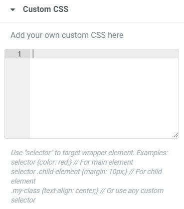
Use “selector” (without the leading dot) to target a wrapper element.
For example, if you’ve placed an image (or any child element) in a column, you may want to style either the wrapper surrounding the image, or the image itself.
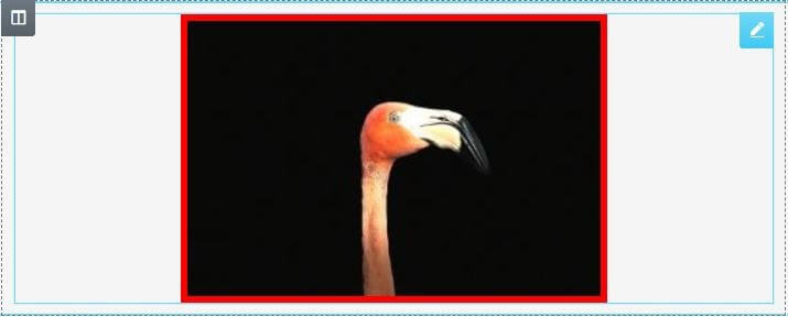
Let’s place a solid 5px red border around the various elements to see what happens.
First, drag an Image widget into a column, and go to Image > Advanced > Custom CSS
Now, in the Custom CSS tab, enter the following:
selector { border: 5px solid red; }
Because you are editing the Image widget, you might be surprised to discover that the border does not surround the image at all. Instead, it surrounds the wrapper element, which in this case, is the column that the image is within.

To specify the child element, or in this case, the image, enter the following into the Custom CSS instead:
selector img { border: 5px solid red; }
This will place the border around the image because you’ve specified that it should affect the “selector img”.
Now try this with another example.
Drag a Button widget into a column, and give it 10px of padding so you can see the column surrounding it nicely. Do this by going to the button’s Advanced tab, and setting Padding to 10 for all sides.
Your button should now look something like this (your colors may vary):

Next, let’s apply a background color using Custom CSS.
Enter the following:
selector { background-color: #ffff00; }
As before, this will apply to the wrapper of the button element, rather than the button itself. This time, you’ll notice that the 10px of padding prevents the entire column from being affected by our style.

And of course, if you want the background color to apply to the button instead of its wrapper, you can enter the following instead:
selector .elementor-button { background-color: #ffff00; }
This will result in the button’s background being yellow.

Use selector as an Elementor shortcut to help you write Custom CSS more quickly and easily. You always have the option, however, of using your own custom class instead.
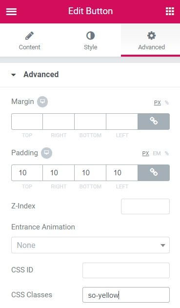
Let’s redo that button background, but this time, we’ll give the button a custom class, which we’ll name “so-yellow”. (Go to Advanced > CSS Classes and make sure you don’t include the preceding dot here).
Now, in the Custom CSS tab, instead of using “selector”, we’ll simply reference the custom class “.so-yellow”, and yes, you will need to include the preceding dot here.
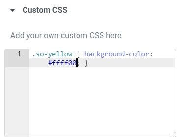
As expected, the button’s wrapper now shows our bright yellow color for its background.

What happens if we then target the button itself?
Enter the following:
.so-yellow .elementor-button { background-color: #ffff00; }
You’ll notice that the button’s purple color does NOT change!

That’s because our new style needs an !important declaration added in this case.
.so-yellow .elementor-button { background-color: #ffff00 !important; }
Now, our styling is applied, and our button is yellow again.

Just for fun, and to prevent our button’s text from being lost in the bright yellow background, let’s finish styling the button by changing the text’s color. We’ll also add a border to the button as well. Regardless of which method you use, “selector .elementor-button” or “.so-yellow .elementor-button”, the additional code will be the same.
selector .elementor-button { background-color: #ffff00; color: #000000; border: 2px solid #000000; }
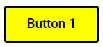
Enjoy using selector whenever you want to quickly add Custom CSS to target that element’s wrapper.
Tip: For a list of Class names, see Frank Tielemans’ excellent Widget Classname Reference Guide
